Having a diversified portfolio is easy to understand. 
As illustrated nearby it essentially means “Don’t put all your eggs in one basket!” I set aside my deep dislike of chickens to use this illustration.
Being diversified means that at any given time there is something in your portfolio that is lagging and something in your portfolio that is doing well.
This is where the emotions can get in the way.
It is human nature to look at whatever is on fire and think “I gotta get more of that!” Conversely it’s natural to look at the laggards and think “I gotta get rid of that!”
But here’s the thing – every dog has its day and what goes up is almost certainly going down eventually.
To illustrate the point further, we look at the investor’s “Periodic Table” from Callan.
This table ranks 10 different asset classes each year by performance, the best performing asset class is on top of the chart with the worst on the bottom.
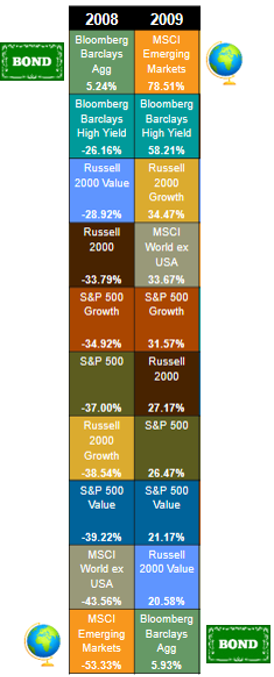
 Let’s take a look at 2008 and 2009.
2008 was not a great year for the stock market. (Understatement). Over long periods of time stocks outperform bonds, but 2008 was an exception.
Take a look at the chart.
The top performing asset class in 2008 was “Bloomberg Barclays Aggregate US Bond Index” which is an index of US government and corporate bonds with maturities more than a year. It returned 5.24%. Every other asset class was double digit negative. Like I said, not a great year for the stock market.
The doggiest of the dogs that year was “MSCI Emerging Markets” (marked with a globe) an index of stocks from 23 Emerging Countries around the world – places like Brazil, Colombia, Czech Republic, Mexico, Poland, Thailand, Turkey etc.
Emerging Market stocks lost a stomach-lurching 53.33% of their value in 2008. Ouch.
Time to ditch stocks and buy bonds? No!
Take a look at the very next year – 2009.
What is the winning asset class that year? Emerging Markets! They were up 78.51% that year, erasing over ¾ of their 2008 loss.
And what was the losing asset class in 2009? The US Bond Index!
Let’s look at the last two years: 2016 and 2017
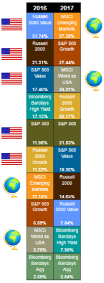
In 2016 five of the top six asset classes were US stocks (US small and large company stocks – marked with an American flag).
Stocks outside the US* (marked with a globe) were 7th and 9th place respectively.
*the Emerging Market Countries discussed above and the MSCI World ex USA index which tracks stocks of Developed Countries like Japan, Norway, Spain, Canada and the UK.
Time to ditch the rest of the world and buy American? No!
In 2017 Emerging Markets once again trounced the field and Developed Countries came in 3rd place.
Moving in and out of asset classes based on what is hot today is a losing proposition. The rankings change every year!
You can view 20 years of the periodic table HERE.
Which asset class will be the winner in 2018? I answer with confidence and pride “I do not know.”
HINT: Nobody else does either, not even people screaming on TV. But I do know that my family owns it-and so do my clients!*
*Full Disclosure: the one box in the chart I do not purchase is the “Bloomberg Barclays High Yield”; this is an index of High Yield bonds that are informally known as “junk bonds”. They are high yield (or junk) because the credit rating of the issuers are low. In 2008 they were down over 26%. I prefer my bonds to be boring. Super boring.
